We all dislike rules, but the rule of thirds is one worth learning. Lots of images look better when following this rule. Imagine the image you're composing split into three segments horizontally, and three vertically. The grid image below illustrates the point; the horizon line is roughly a third of the way up the frame. The sky fills the other two thirds. The lighthouse is also a third of the way in (roughly) from the edge of the frame. I deliberately place my subjects roughly where the lines intersect if I can. Roll over the image to lose the grid: -
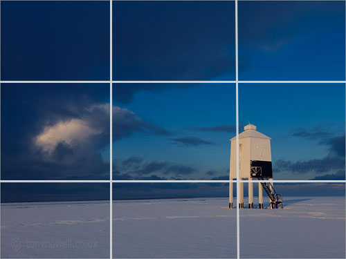
^ Roll your mouse over the image to lose the grid
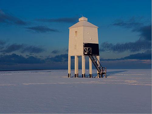
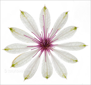
Most beginners place their subjects in the center of the frame. This is fine if you're filling the frame with a face or a flower, but can look boring if the subject is further away. Here's the same image cropped with the lighthouse in the centre (yawn)
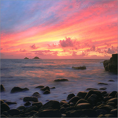
Placing the horizon line half way up the frame is generally not good - it makes for a dull image. Don't ask me why, it just is. Of course there are exceptions, like if the foreground and the sky are both equally interesting, so once you've learned the rule of thirds, try to break it - the image here doesn't conform to the rule, but it still works because the sky and the foreground are equally compelling
If the sky wasn't so good, I'd have pointed the camera down and stuck to the rule of thirds. If the foreground wasn't so interesting, I'd have pointed the camera up and stuck to the rule of thirds
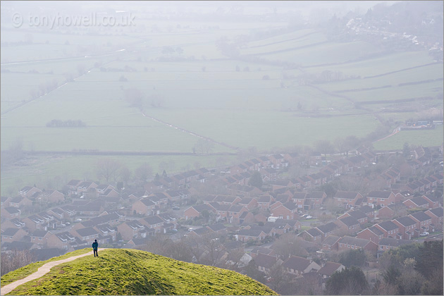
The image of Glastonbury Tor doesn't conform to the rule of thirds either, but what makes it work is the difference in contrast between the foreground and background
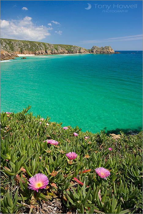
For this image of Treen Cliffs, Porthcurno Beach, Cornwall, I've created a sense of depth by having a subject that everyone realises is fairly small (the flowers) in the bottom of the frame leading up to the peninsula, which everyone realises is large but far away. This picture conforms roughly to the rule of thirds
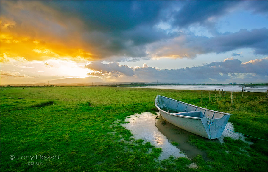
One of my favourite types of composition is when the main subject in one corner is offset by the secondary subject in the corner diagonally opposite. This gives the composition balance, and encourages the eye to wander around the frame. There is an implied diagonal line from the boat to the sun, and diagonals create dynamism in an image (whereas straight lines represent peace and stillness). The same thing can be seen in the image above in a lesser way; the diagonal goes from the main flower to the end of the peninsula
In the image here, straight lines help create a feeling of stability; adding to the peace and stillness
So here's the important question; what are you trying to say about whatever's in your viewfinder? How can you express it well? Certainly not by snapping away several shots and hoping one of the images comes out well. Slow down, engage with the subject. Take your time and think about what drew you to it. Zoom in and out until it feels right
‘My compliments on a truly excellent website......it's fantastic to see a professional spending time on his website to provide hints and tips to people like me. Your pictures also provide me with great inspiration to do better.’ M.P, Plymouth, UK